Pop-up Type Museum
2022 | COMD-404
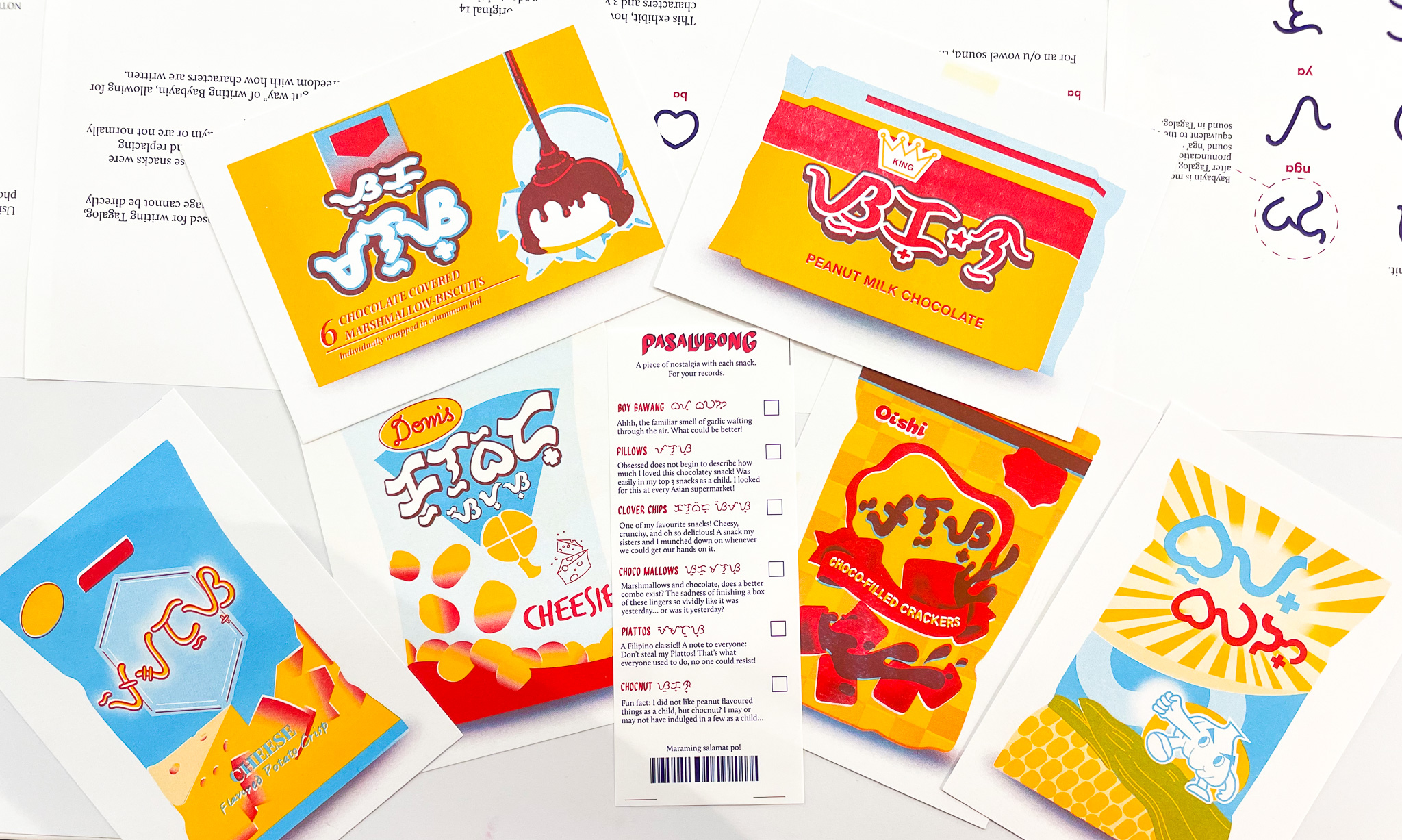
An exhibit about the ancient Philippine script called ‘Baybayin’- presented through the Filipino tradition of ‘Pasalubong’ (gift-giving). Told through an imaginative scenario of what Baybayin may look like in modern times through redesigning the logos of my favourite childhood snacks.

Concept
Baybayin is an ancient Philippine script that died out after the Spanish colonization of the Philippines. In recent years, it has had a resurgence with people using it for artistic purposes and even creating functioning typefaces. Although it has been gaining traction, it has rarely been applied as an actual writing system. Because of this, I wanted to imagine what Baybayin may look like today by recreating the logos of some beloved Filipino snacks from my childhood. To go along with this, I also incorporated the Filipino traditon of Pasalubong, which is essentially gift-giving. Overall, this was a way to present a lesser-known aspect of Filipino culture through one that is recognized and constantly practiced to this day.
About Baybayin
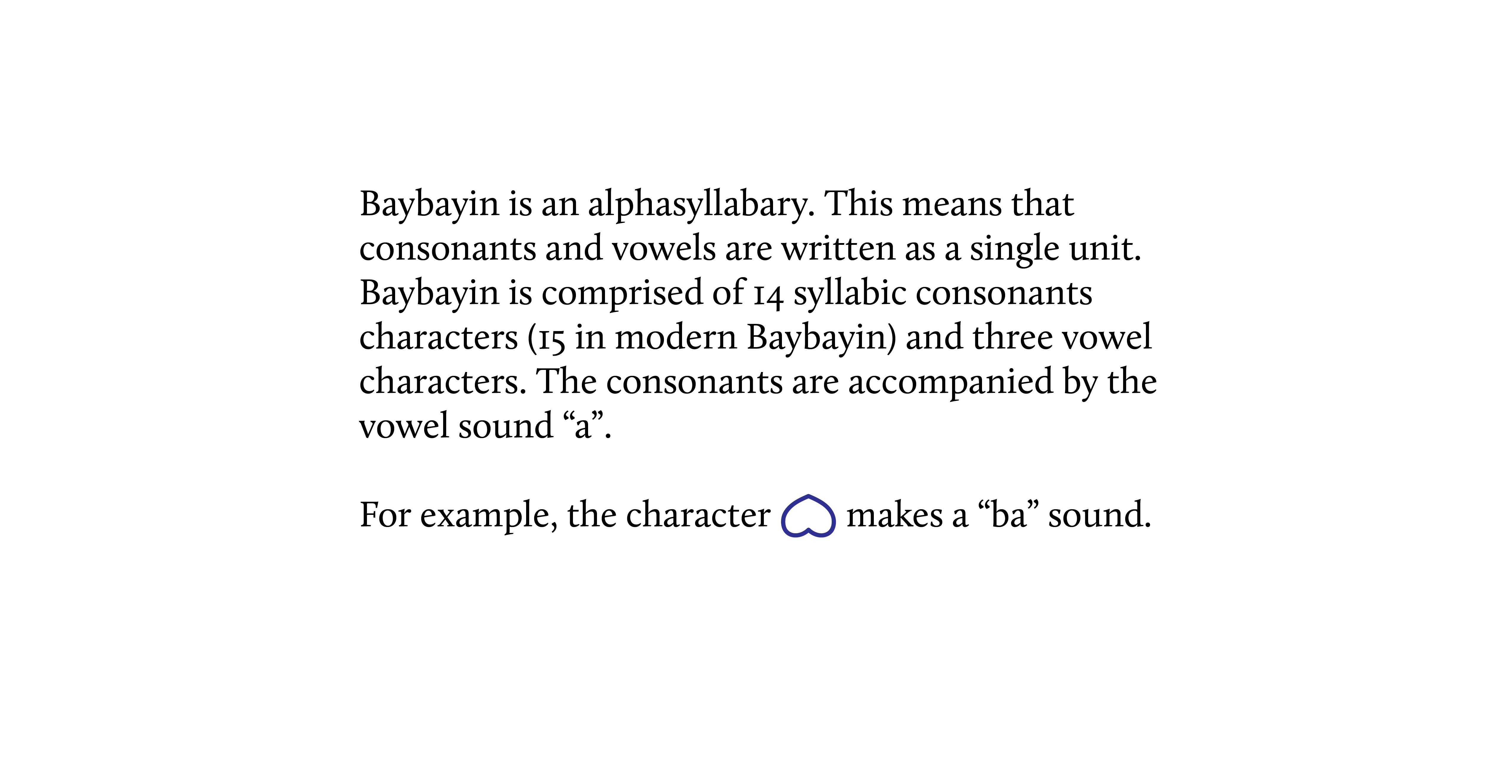
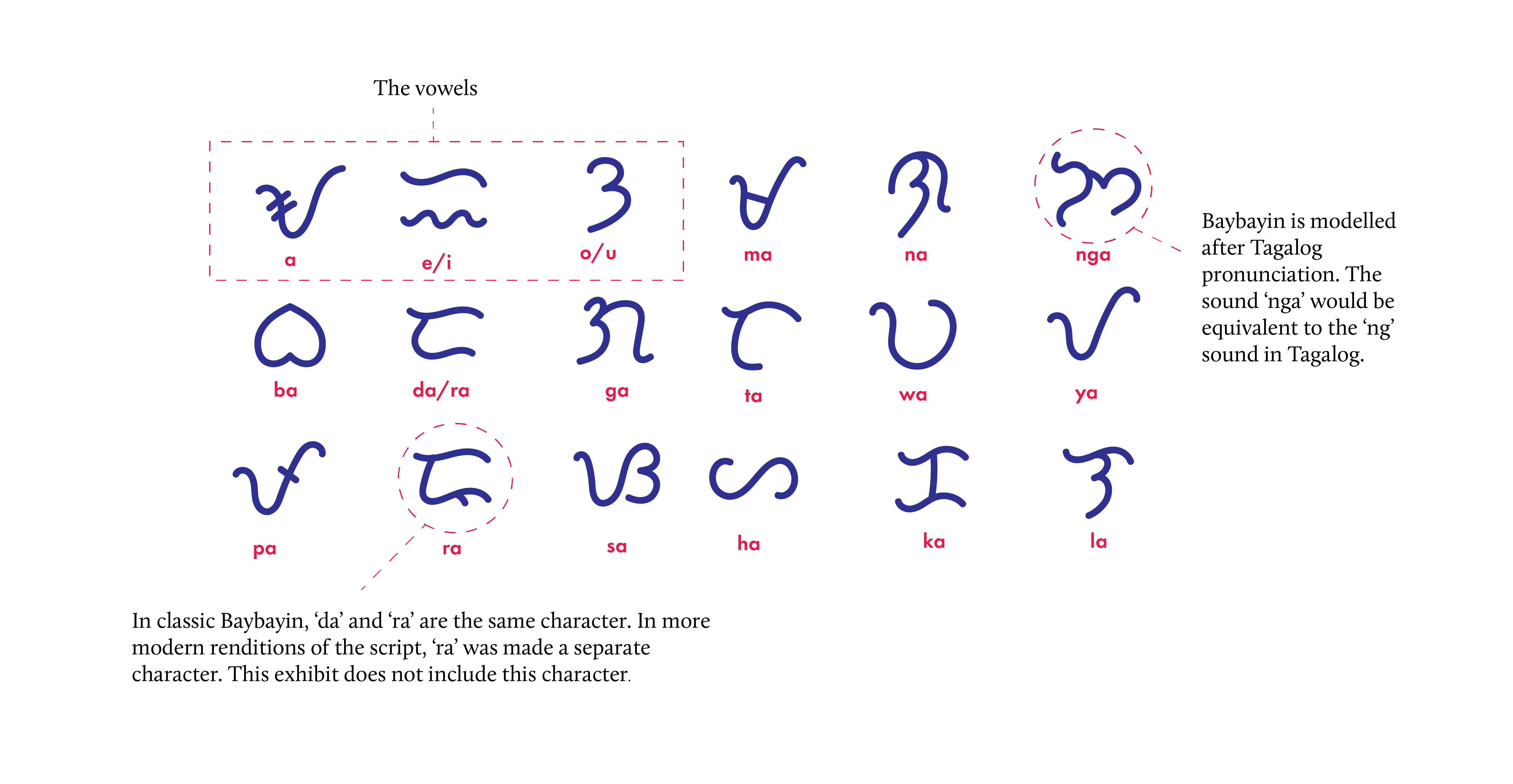
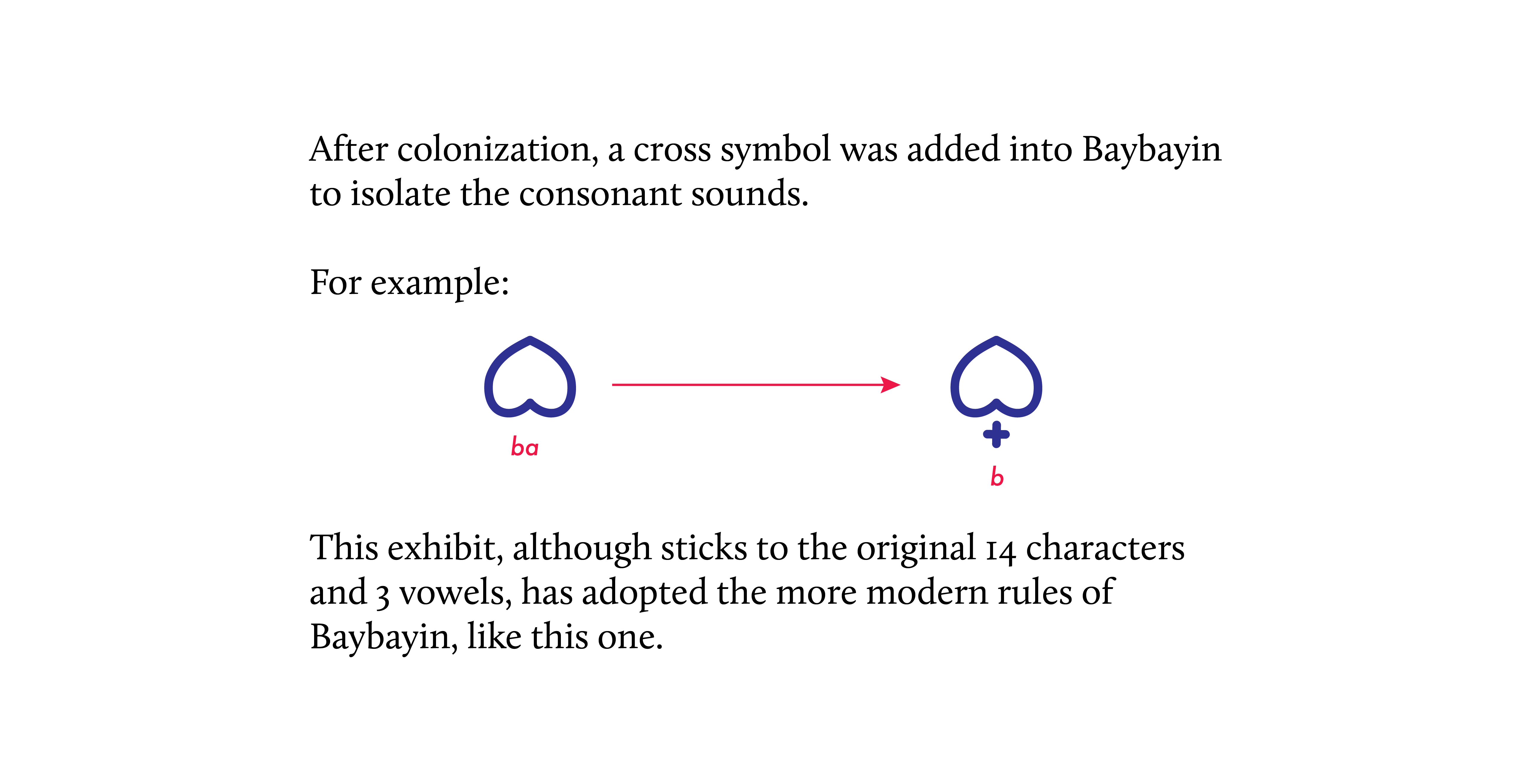
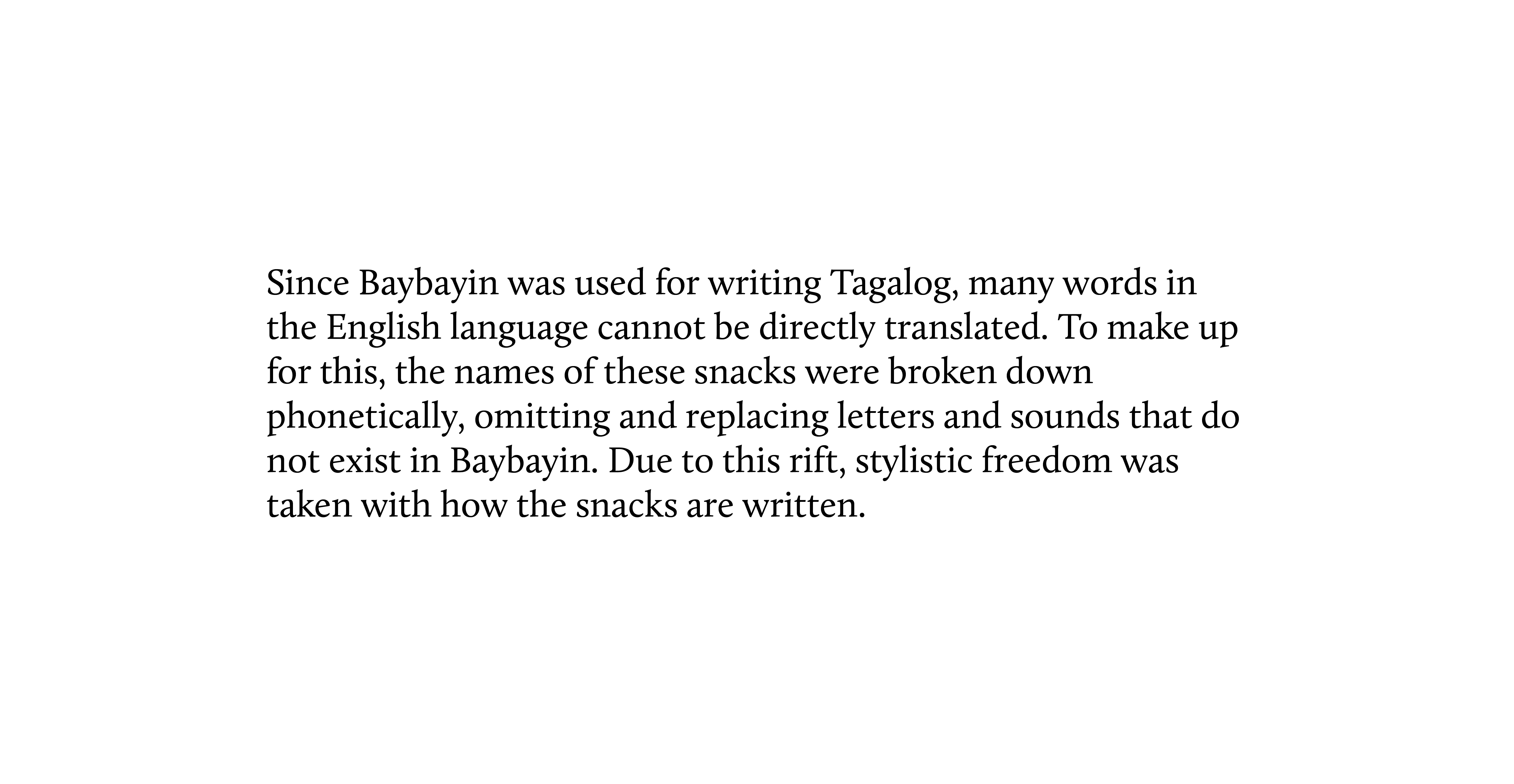
To learn about how Baybayin works and was applied to this exhibit, please read the pages below! ︎︎︎
![]()
![]()
![]()
![]()
![]()
![]()
![]()
![]()
![]()




Designing the Logos
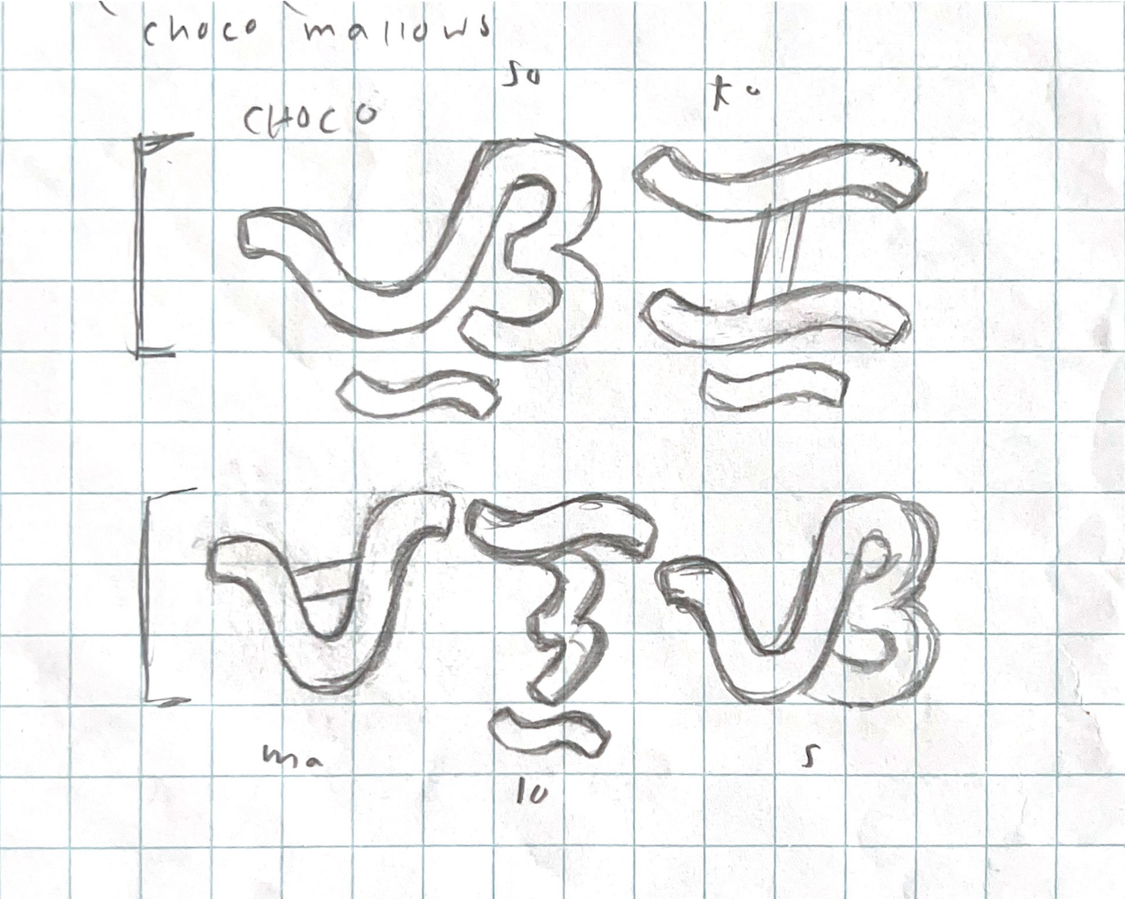
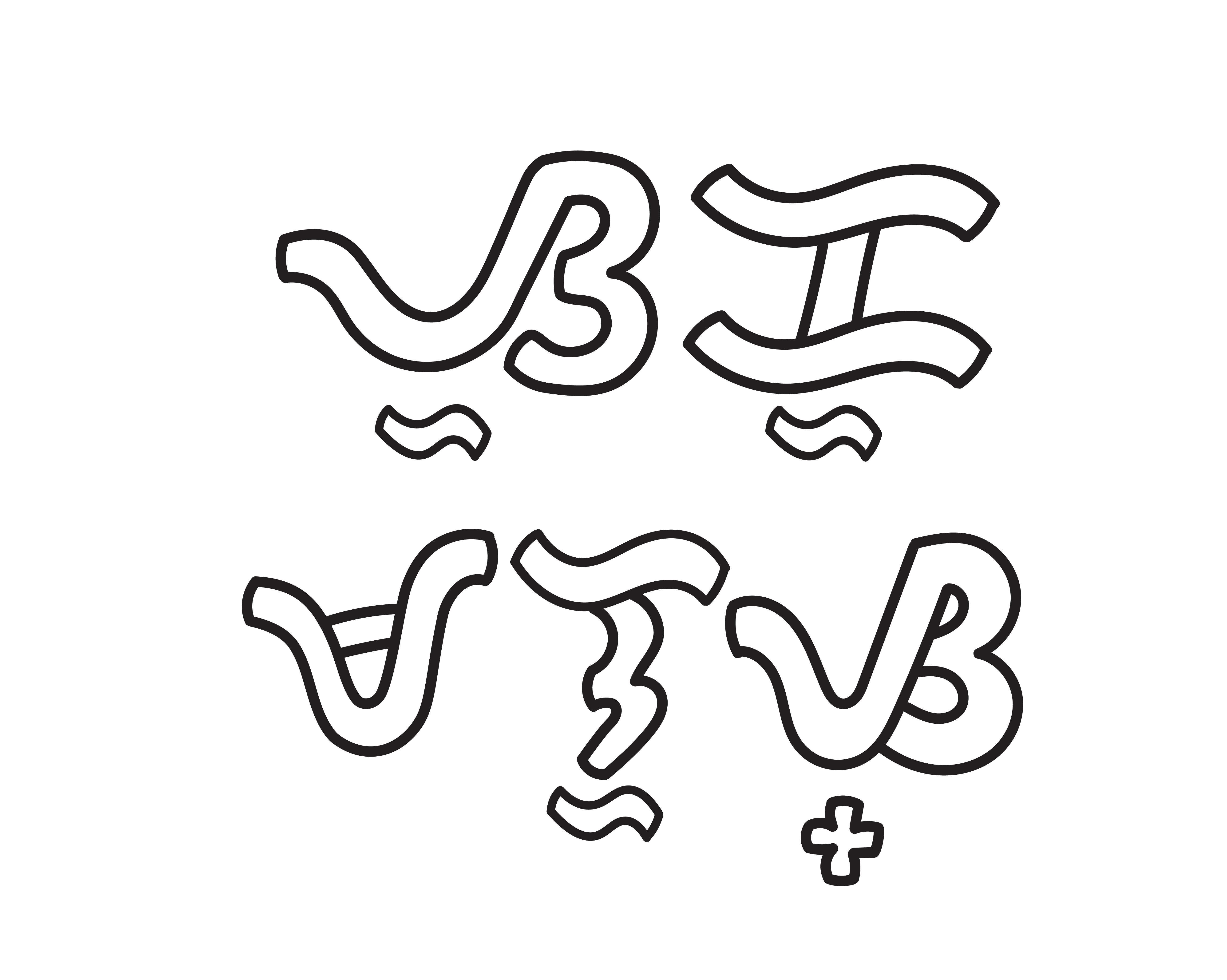
Since the typefaces used for these snacks would not have a Baybayin version, I created the Baybayin versions by imitating certain characteristics of the original typeface. Some factors that were taken into consideration were if it was serif or sans-serif, block or rounded letters, as well as its weight. After picking out key elements, I then went on to emulate them by first hand-drawing the Baybayin logos. Afterwards, I vectorized and cleaned them up in Adobe Illustrator.
![]()
![]()
![]()

Creating the Prints and Packaging
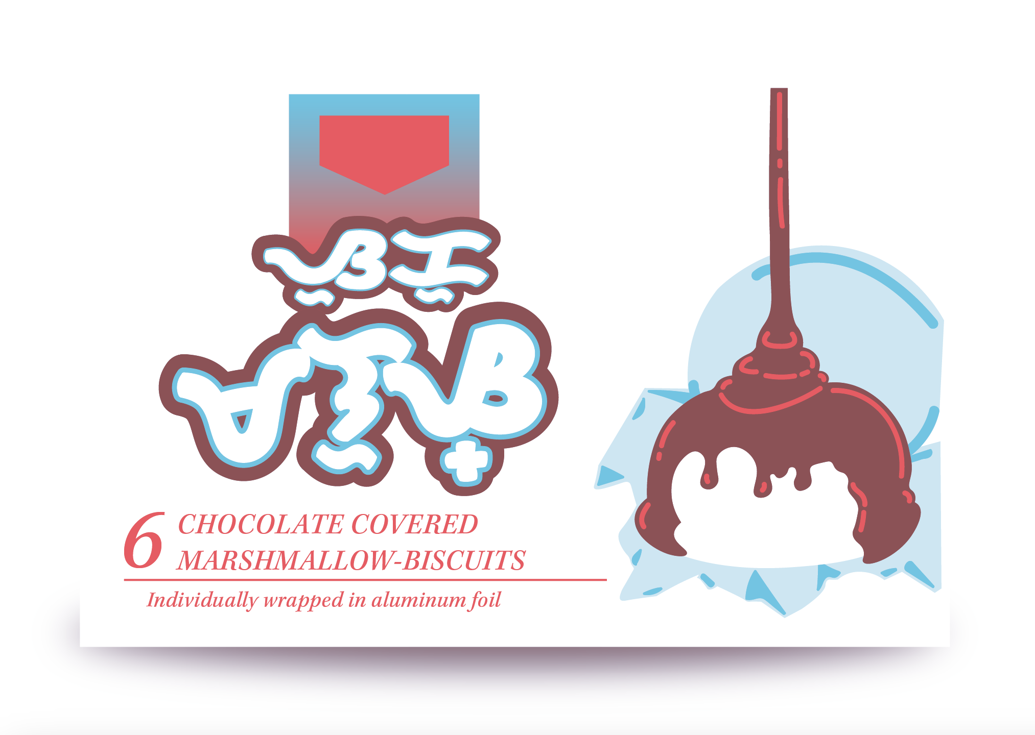
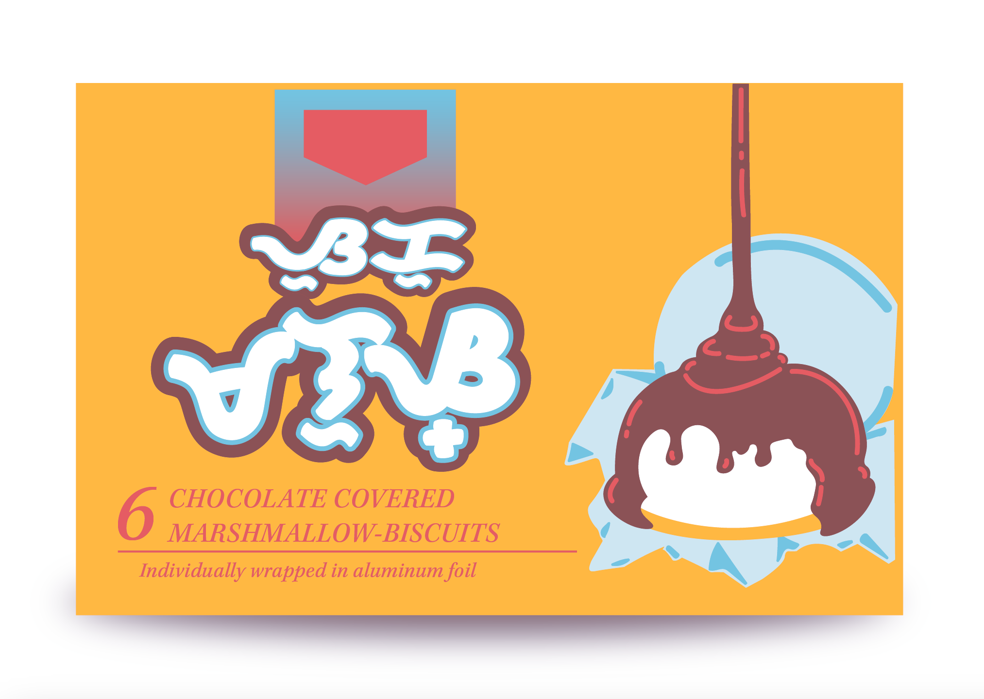
After vectorizing the logos, I began working on illustrating the snacks. I used a reference photo for each snack and illustrated them on Adobe Illustrator. As I decided to risograph print these illustrations, I took into consideration what set of colours were common throughout all the snacks, but were similar to the original packaging. Since the real packaging mostly used primary colours, I settled on using red, sunflower yellow, and aqua as my riso colours as they were within the same vein as the originals. These particular colours were also easier to blend and layer together to create other colours such as green and brown.
![]()
![]()
![]()
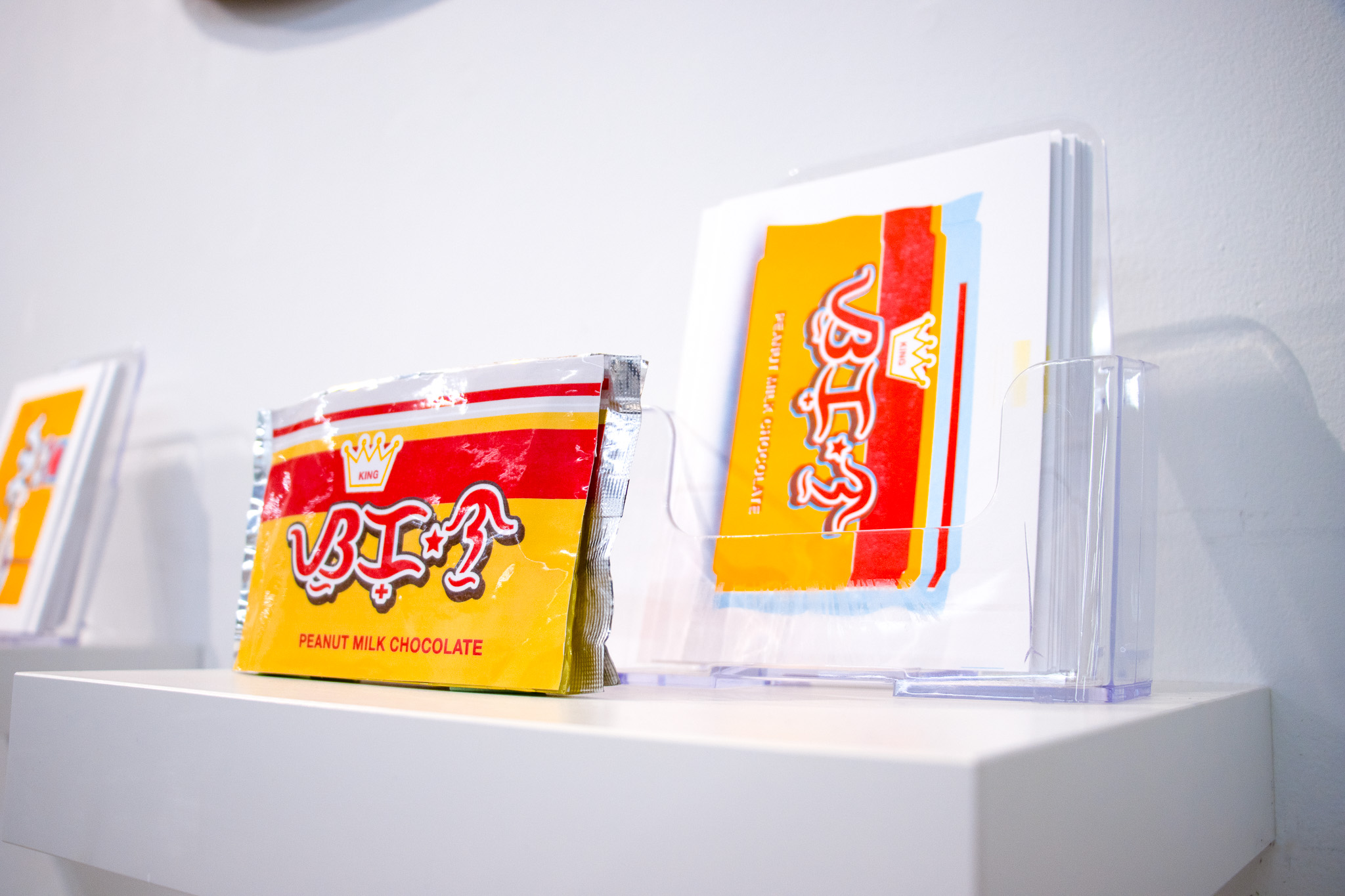
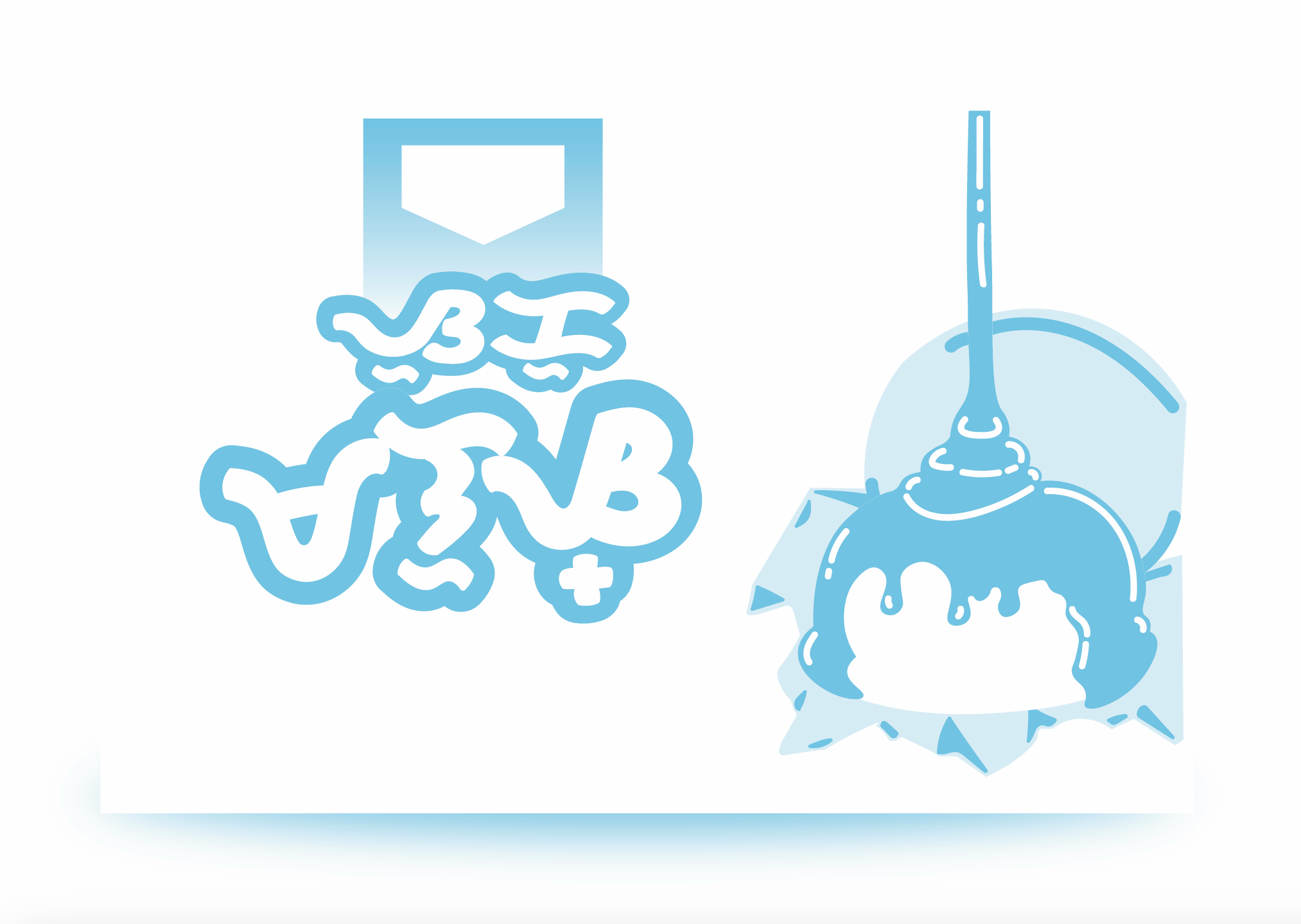
With the packaging already illustrated with the new Baybayin logos, the next step was to put them onto the real snacks. To put the new labels on the snacks, I measured each of the packages and resized the illustrations to fit within those measurements. To make it as accurate to the original designs as possible, I recoloured the illustrations to match the existing packages. Then, the new labels were printed on sticker paper and put directly on top of the existing designs on the physical bags and boxes (final product can be seen below).
![]()

The Posters
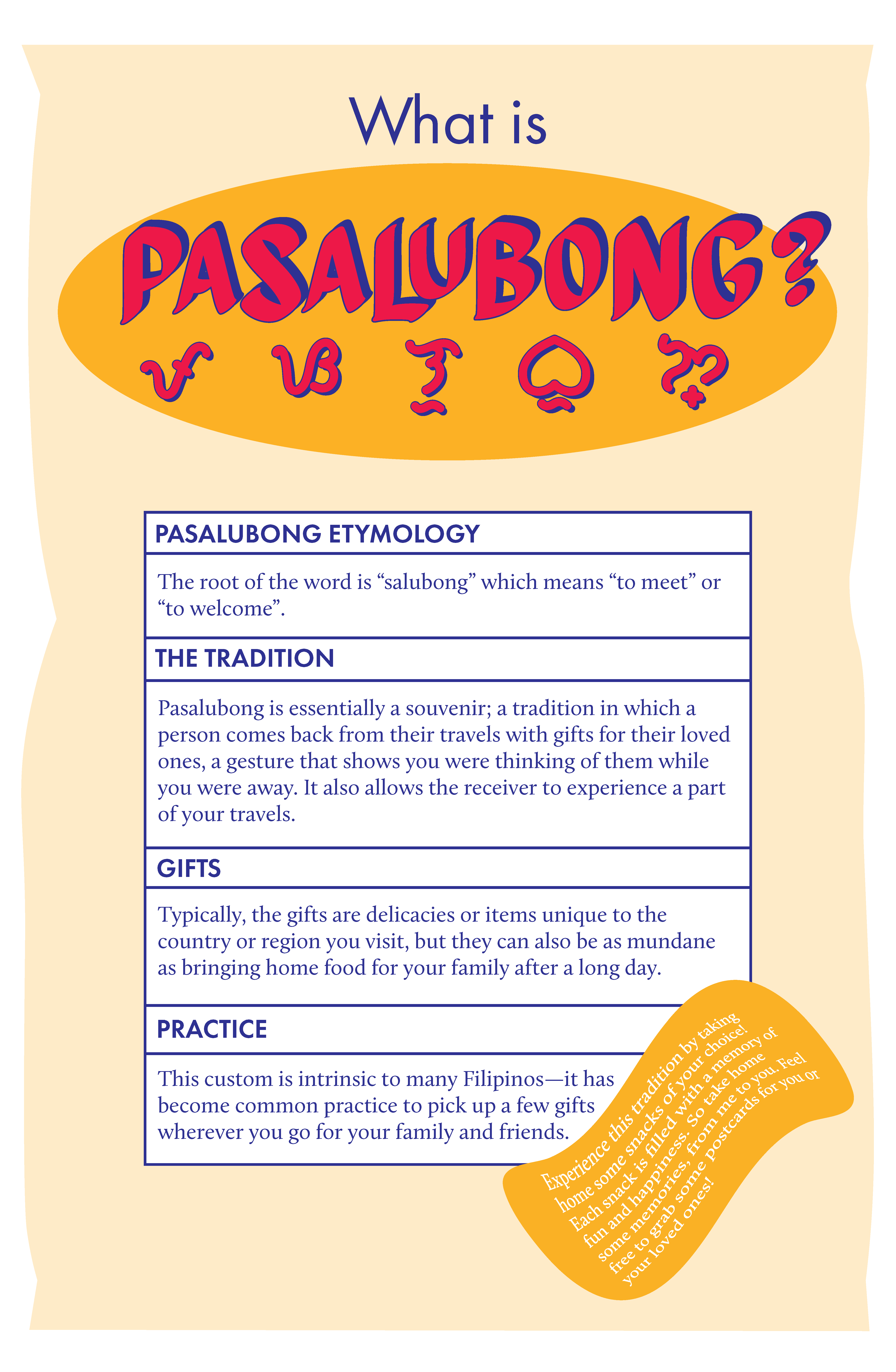
To add context to my exhibit, I created two posters that contain information about the history of Baybayin and what Pasalubong is.
![]()
![]()

The Final Display


